Bakia Consulting

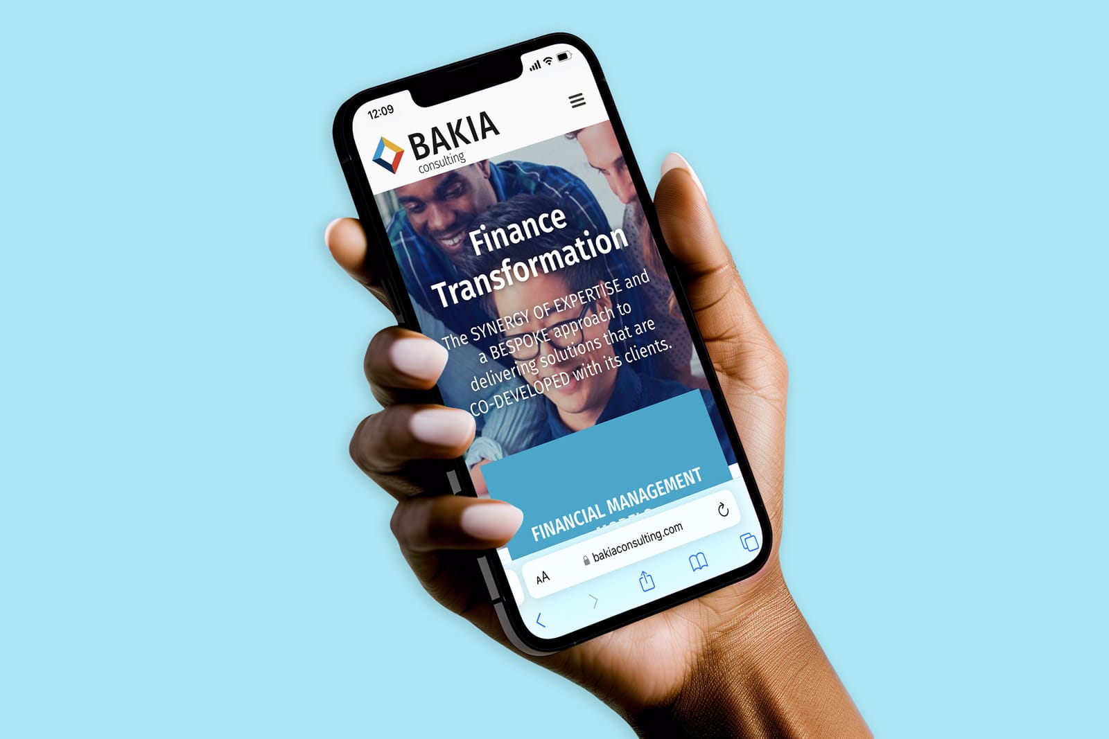
The transformation of BAKIA includes a new visual identity, refreshed brand colours, print materials, and a modern website, all aimed at modernising the brand. This redesign stays true to the core elements created by the founder.

BAKIA Consulting specialises in revolutionising finance through a customised co-development approach.

  • Logo & Logotype
  • Brand Colour Palette
  • Design Collaterals (PPT, Word)
  • Responsive Web Design
  • Elementor builder
  • Dynamic Translation (WPML)
  • Maintenance & Training
The Client

Bakia Consulting

BAKIA provides consulting services centered around four core pillars aimed at transforming the finance function within both private companies and public organisations. Emphasising the importance of people within its methodology, BAKIA manages all finance transformation projects with a dedicated focus on effective change management.

The Challenge

Improving Communication Tools While Maintaining Audience Engagement

BAKIA recognised the immediate need for a more dynamic brand image. The original brand elements had become dated since the company’s inception, displaying signs of aging and lacking aesthetic rigour. Two critical areas required attention: strengthening the foundational pillars supporting the services and refining the colour palette application.

As specialists in guiding clients through finance transformation with a strong emphasis on effective change management, BAKIA aimed to enhance its impact and project a positive energy to both current and future audiences.

So the challenge lay in effecting brand change seamlessly — taking calculated risks without compromising customer relationships and demonstrating excellence in change management in the process.

In essence, our goal was to drive change smoothly, maintaining public confidence in BAKIA’s ability to lead transformations without disruption.

The Solution

Identifying and keeping key elements capable to sustain modern visual standards

Redesigning BAKIA Consulting’s brand involved a strategic balance between revitalisation and continuity to ensure a seamless transition. Retaining the essence of the original logo’s four segments and corresponding colour palette was pivotal, honouring BAKIA’s established service pillars.

The primary focus was on refining and strengthening the visual identity. This included simplifying the logo, eliminating unnecessary details. In typography, the choice of a sans serif font was deliberate, conveying a bold and assured personality while evoking a sense of reliability and maturity for the brand.

a project like this in mind?